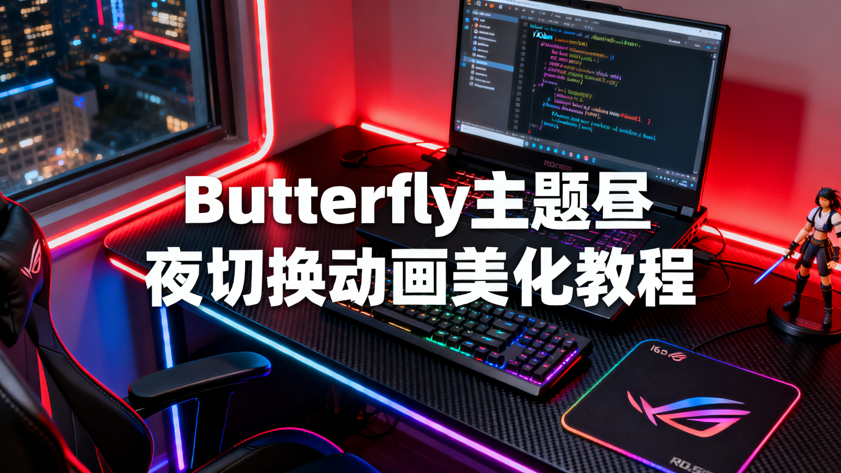
Butterfly主题宽屏优化最详细最简单保姆级教程
前言
默认的 Butterfly 主题布局宽度为 1200px,在现代的大屏显示器上会显得比较局促,两侧留白过多。本教程将教你如何优化 Butterfly 主题的宽屏布局,让博客在大屏幕上显示更加舒适美观。
优化内容
- ✅ 页面最大宽度:1200px → 1400px
- ✅ 侧边栏宽度:26%(动态) → 312px(固定)
- ✅ 主内容区宽度:74% → 自动计算(总宽度 - 侧边栏)
- ✅ 文章头图高度:400px → 460px
- ✅ 完美支持响应式(手机/平板不受影响)
效果对比
修改前
- 页面宽度:1200px(两侧留白多)
- 侧边栏:26% 动态宽度(不同屏幕下宽度不一致)
- 文章头图:400px(稍显矮小)
修改后
- 页面宽度:1400px(充分利用屏幕空间)
- 侧边栏:312px 固定宽度(视觉更稳定)
- 主内容区:自动适配剩余宽度
- 文章头图:460px(更大气)
视觉提升: 页面宽度提升 16.7%,阅读体验更加舒适!
修改步骤
第一步:调整页面布局宽度
找到文件:themes/butterfly/source/css/_page/common.styl
修改内容
1 | .layout |
关键修改点
.layout的max-width:1200px→1400px- 主内容区宽度计算:
width: 74%→width: calc(100% - 312px) - 无侧边栏时宽度:
max-width: 1000px→max-width: 1400px
第二步:固定侧边栏宽度
找到文件:themes/butterfly/source/css/_layout/aside.styl
修改内容
1 | #aside-content |
关键修改点
- 固定侧边栏宽度:
26%→312px - 添加宽度范围:
max-width: 312px、min-width: 300px - 响应式适配:小屏幕下
max-width: none,恢复自适应
第三步:增加文章头图高度
找到文件:themes/butterfly/source/css/_layout/head.styl
修改内容
找到 &.post-bg 部分,修改如下:
1 | // post |
关键修改点
- 文章页头图高度:
400px→460px(提升 15%) - 手机端不变:保持
360px,确保移动端体验
完整修改总结
| 文件 | 位置 | 原始值 | 修改后 | 说明 |
|---|---|---|---|---|
| common.styl | .layout max-width |
1200px | 1400px | 页面最大宽度 |
| common.styl | > div:first-child width |
74% | calc(100% - 312px) | 主内容区宽度 |
| common.styl | .hide-aside max-width |
1000px | 1400px | 无侧边栏时宽度 |
| aside.styl | #aside-content width |
26% | 312px | 侧边栏固定宽度 |
| aside.styl | #aside-content max-width |
无 | 312px | 侧边栏最大宽度 |
| head.styl | .post-bg height |
400px | 460px | 文章头图高度 |
响应式适配说明
桌面端(屏幕宽度 > 900px)
- ✅ 页面宽度:1400px
- ✅ 侧边栏:固定 312px
- ✅ 主内容区:自动计算(1400px - 312px - 间距)
平板端(屏幕宽度 ≤ 900px)
- ✅ 侧边栏移到主内容下方
- ✅ 宽度限制取消,全宽显示
- ✅ 添加适当内边距(0 5px)
手机端(屏幕宽度 ≤ 768px)
- ✅ 单列布局
- ✅ 文章头图高度保持 360px
- ✅ 所有元素全宽显示
注意事项
1. 备份文件
修改前请先备份原始文件,避免出错后无法恢复:
1 | cp themes/butterfly/source/css/_page/common.styl themes/butterfly/source/css/_page/common.styl.bak |
2. 清除缓存
修改完成后必须清除缓存:
1 | hexo clean |
3. 侧边栏宽度微调
如果你觉得 312px 不合适,可以自行调整:
- 更宽:改为
350px(同时修改calc(100% - 350px)) - 更窄:改为
280px(同时修改calc(100% - 280px))
4. 宽度数值对应关系
修改时请确保:
1 | 主内容区宽度 = calc(100% - 侧边栏宽度) |
例如侧边栏是 312px,主内容区就是 calc(100% - 312px)
常见问题
Q1: 修改后页面显示错乱?
A: 请确保执行了 hexo clean 清除缓存,然后重新生成。
Q2: 手机端显示异常?
A: 检查 aside.styl 中的响应式代码是否正确添加了 max-width: none。
Q3: 想要更宽的布局怎么办?
A: 可以将 1400px 改为 1600px 或更大,但注意不要超过主流屏幕宽度。
Q4: 只想改宽度,不想改侧边栏?
A: 可以只修改 common.styl 的 max-width,保持侧边栏为 26%。
总结
通过本教程的三步修改,你的 Butterfly 主题博客将获得:
- 🎨 更宽敞的视觉体验:1400px 布局充分利用屏幕空间
- 📐 更稳定的侧边栏:固定宽度不随窗口变化而跳动
- 📱 完美的响应式:手机/平板端不受影响
- 🖼️ 更大气的头图:460px 高度让首屏更震撼
享受宽屏带来的舒适阅读体验吧! 🚀
本博客所有文章除特别声明外,均采用 CC BY-NC-SA 4.0 许可协议。转载请注明来源 人生大乱炖!